PROJECT

BELAKU INTERIORS

The Goal

The client came with just the word Belaku and had a vision to make that the whole USP of the brand, belaku means light in Kannada. Unlike the usual client requests, this one was welcomed by us, since “light” isn’t the most restricting prompt in the world and presented great opportunities.

  • logo
  • branding
  • print collateral
  • web design
The Belaku wordmark and window mark in terracotta, over a photograph of four people talking in a bright, plant-filled workspace.
A warm interior scene used as the ground for the brand's turning ring motif.
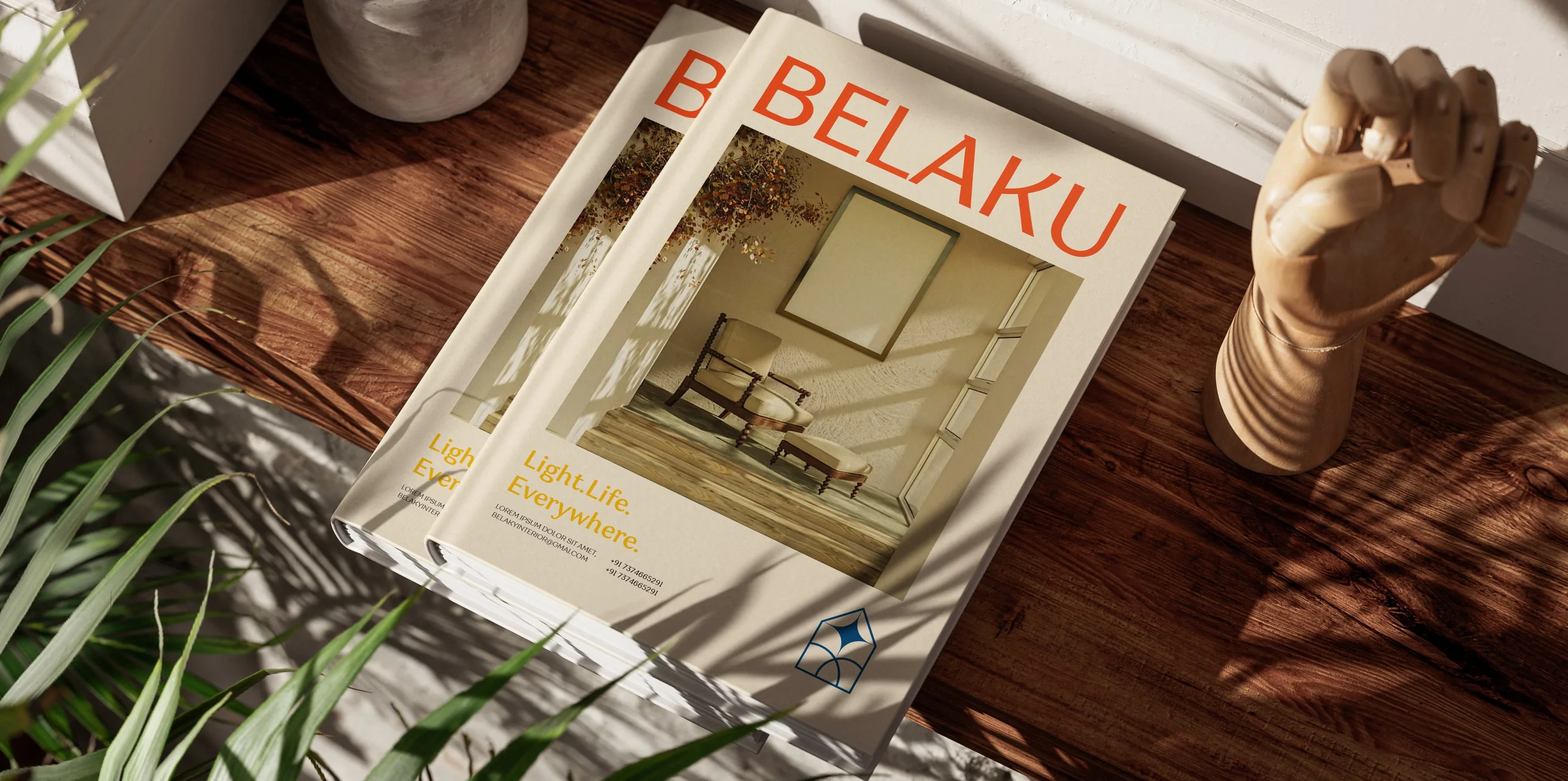
Two copies of the Belaku catalogue stacked on a wooden floor in raking sunlight, the terracotta wordmark and the Light. Life. Everywhere. line on the cover.

The Challenge

How can we set Belaku apart from the hundreds of other interior companies in Bangalore? We chose to follow the philosophy that light is the fundamental breaker or maker of good interior design, and we decided to use its rays and other components as the bread and butter of our brand.
A Belaku catalogue spread.
Belaku identity applied in a finished interior.
Belaku collateral detail.
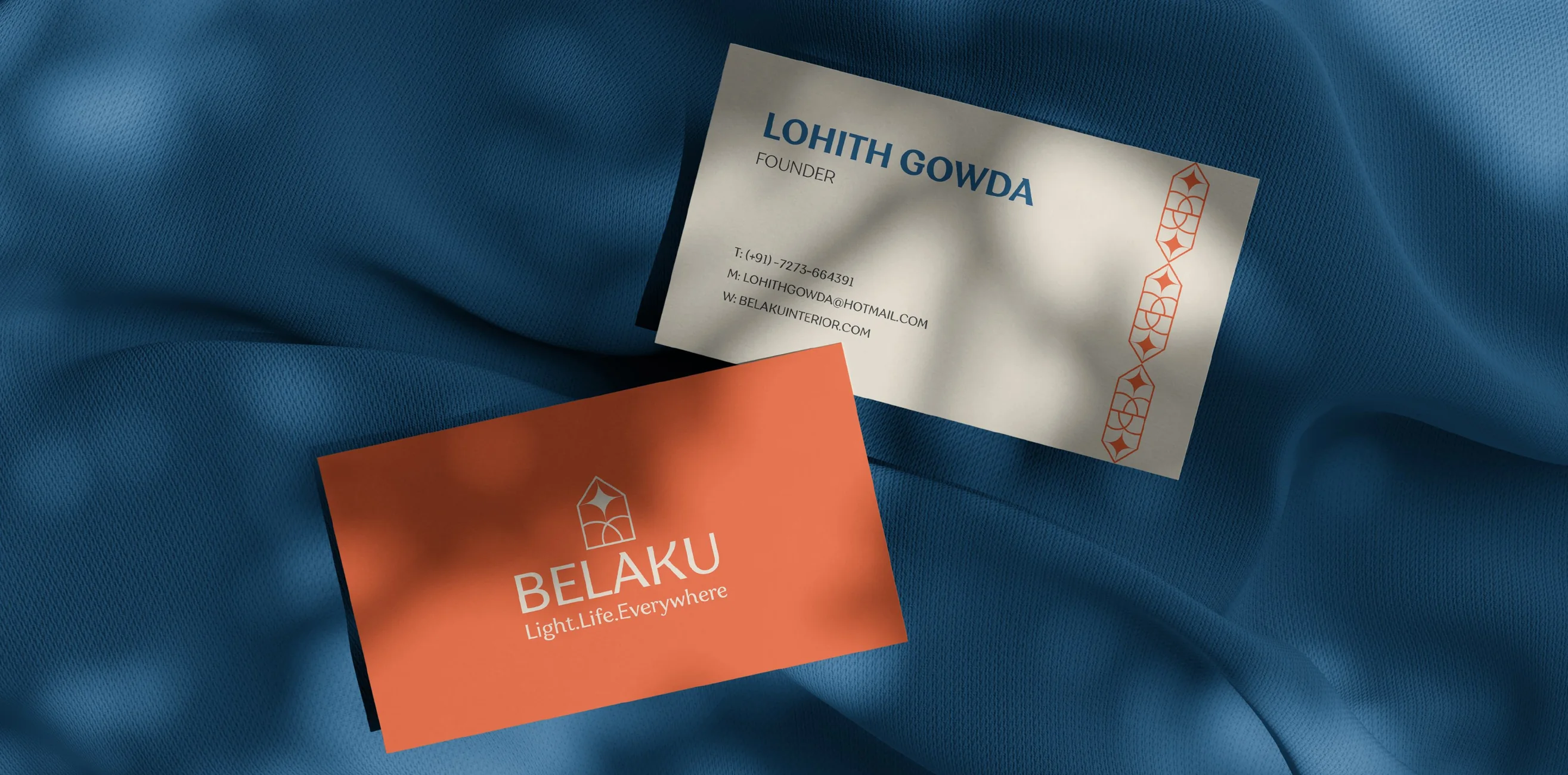
Belaku stationery detail.
Belaku application with the ring motif cropped by the frame.
Belaku identity applied in context.

The Result

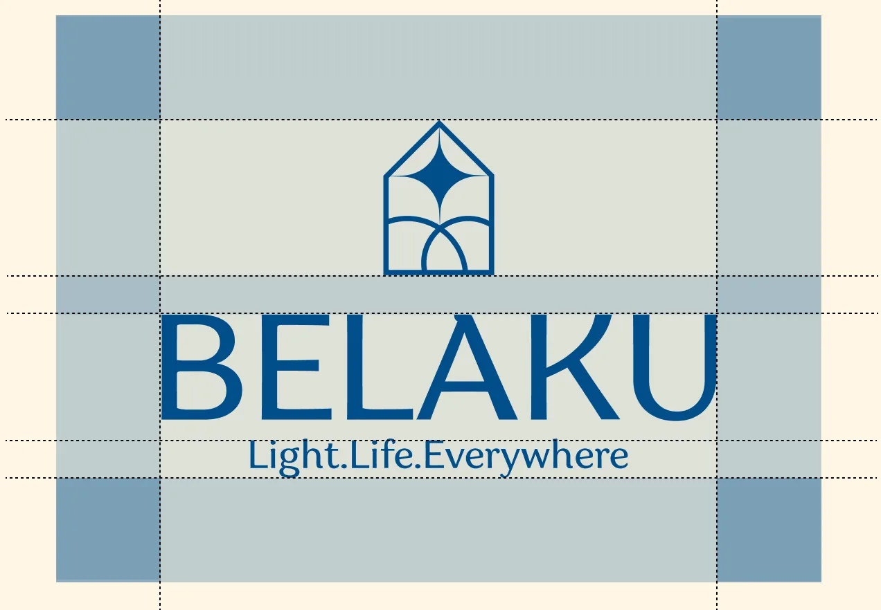
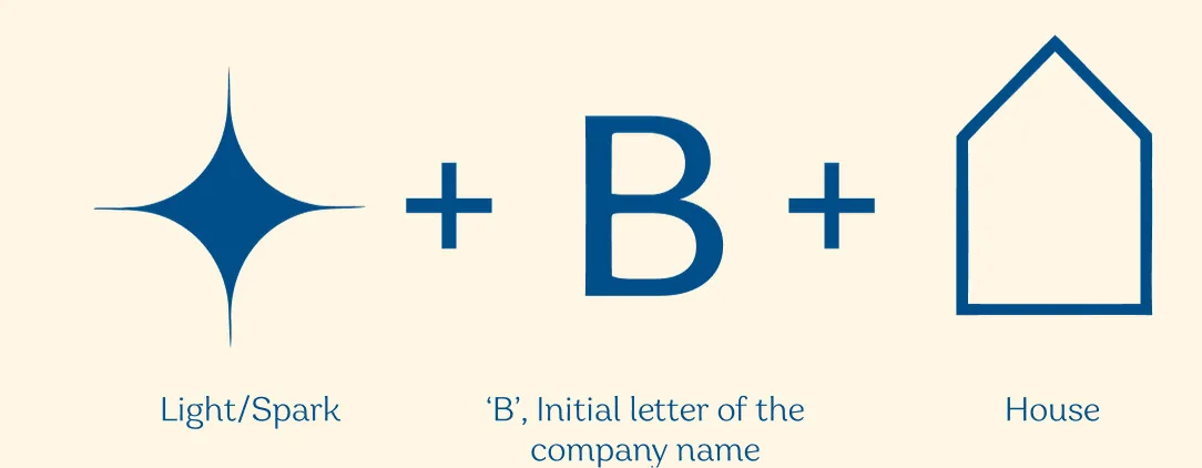
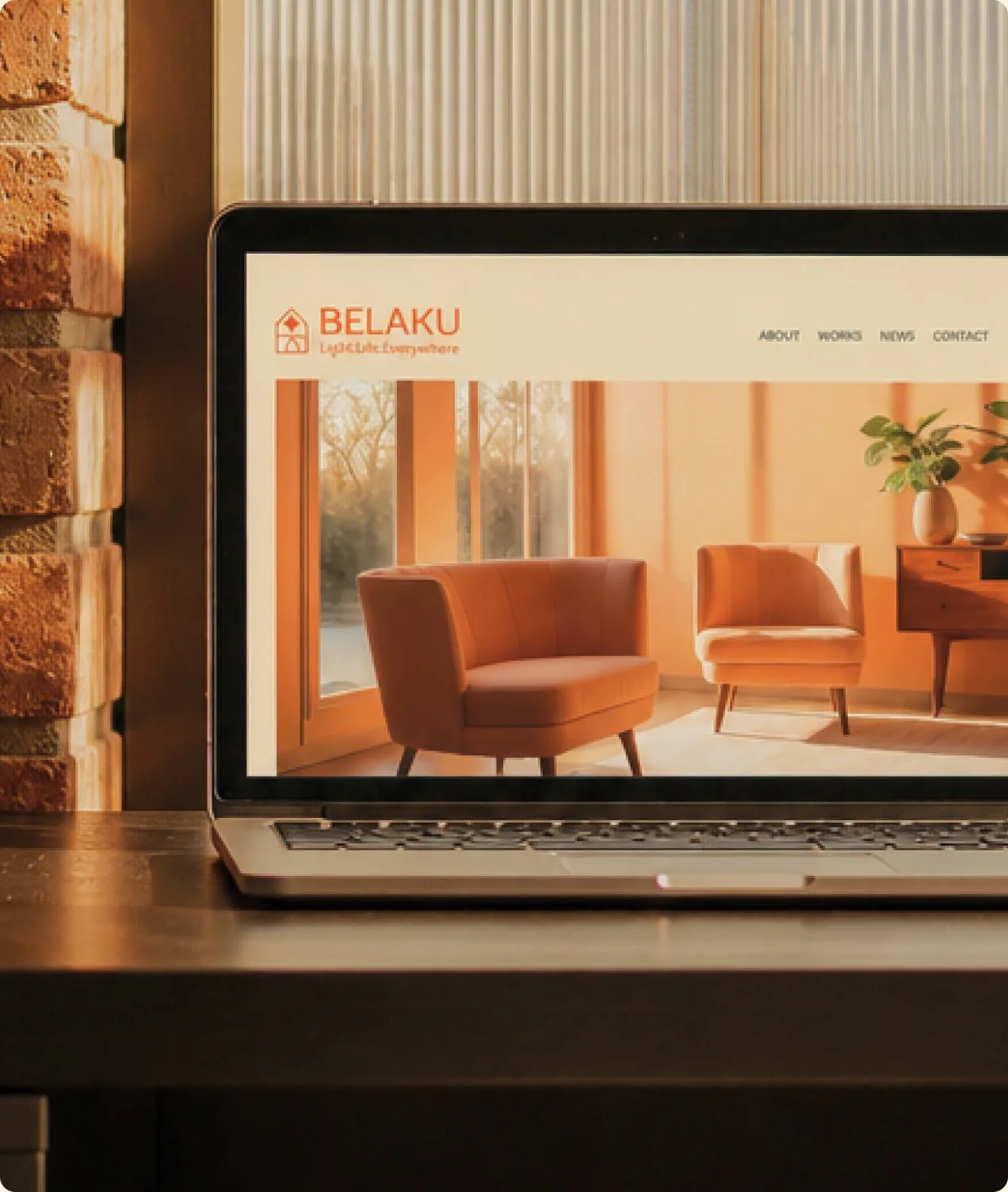
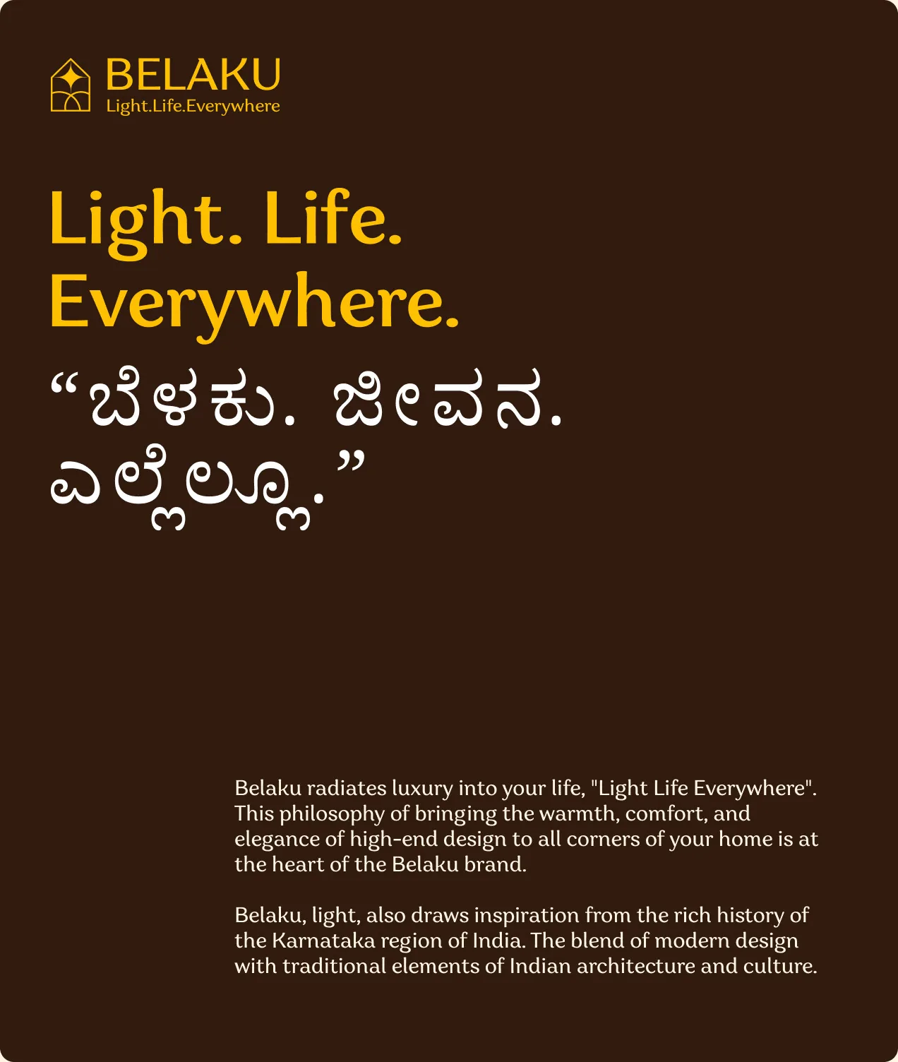
The logo came out of that idea, a spark of light, the B from Belaku and the outline of a house put together into one mark, with the line Light. Life. Everywhere. set in English and in Kannada. From there the rays and rings of light went into everything we made for them, the catalogue, the business cards, the posters and the website, in warm oranges and deep blues.