
PROJECT
Sherbet

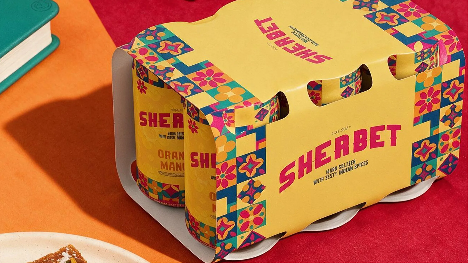
The Process
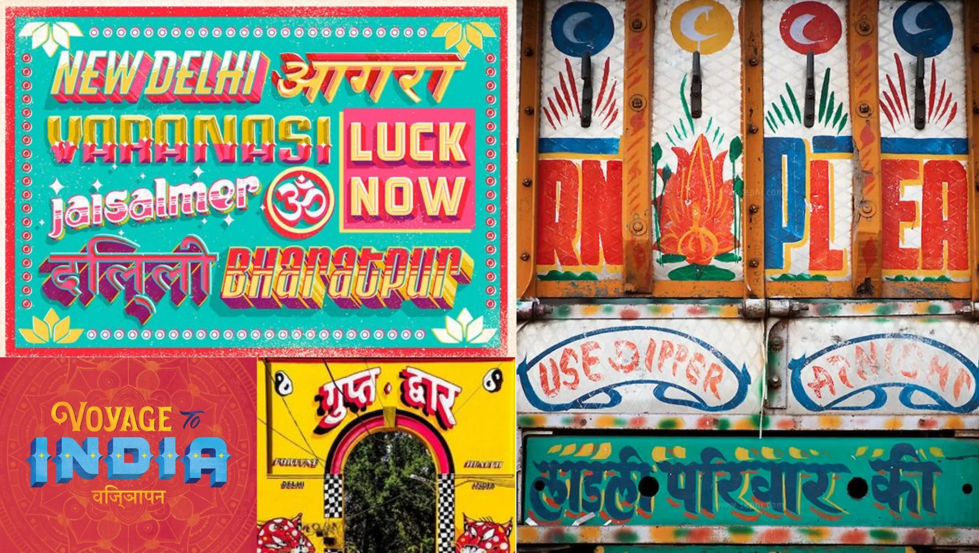
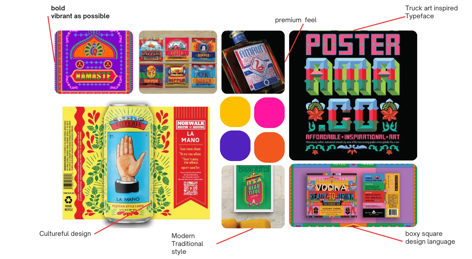
We began our process by not allowing each other to open up a reference website, then we had a conversation about our favourite unintentional Indian design. Sometimes our people make such insane art pieces for spaces that probably don’t need that much love, but hey, no one’s complaining. “Bus ticket”, “Ramraj Muscle guy ad”, “Our Kati roll guy’s cart has a pretty sick design” and a bunch of other Cannes Gold contenders, but immediately we found common ground on truck art. Truck art has to be recognized as an official design language, and we were about to steal its whole flow.
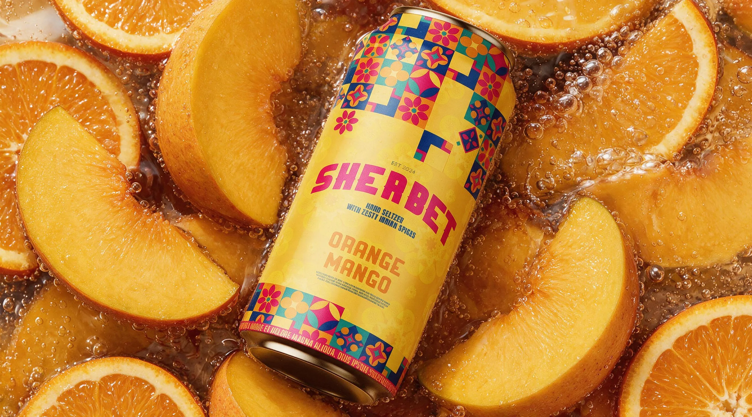
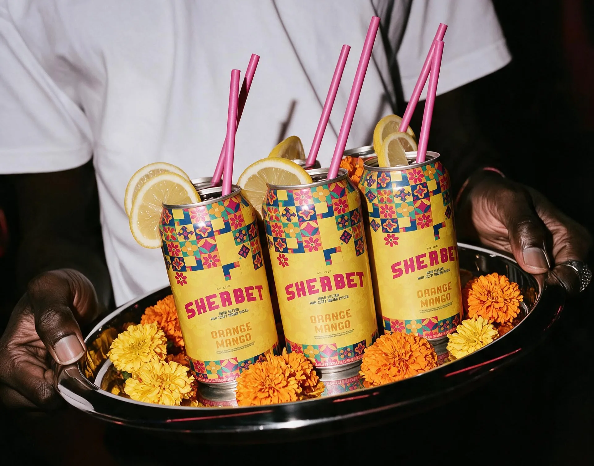
The Outcome
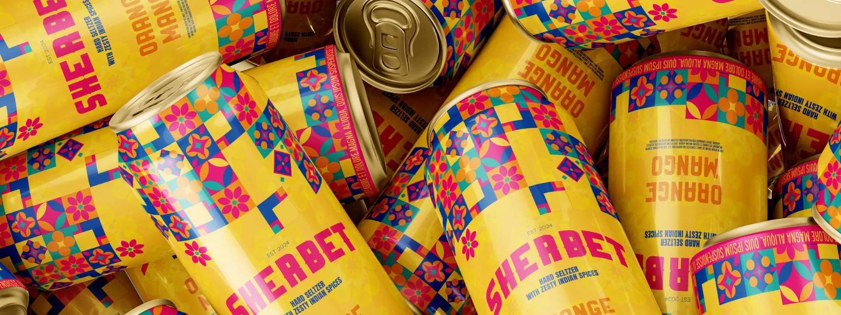
Sherbet is a breath of fresh air in a sea of white cans with minimalist fonts. We wanted our alcoholic brand to look like, if it were a person, it would be hella fun to party with. In the end we were able to create a batch of packaging concepts and art direction elements to send home the message, if it wasn’t clear already. Indians want cooler experiences that actually feel like they’re made for Indians.